Developing an Eye for Good Composition
Some Guidelines
If you have an innate 'knack' for good composition, it will be apparent in many ways - most notably in the way you decorate your home. Hanging pictures on the wall requires a good eye, and so does arranging tabletops and fireplace mantles. I know a woman who, when sitting at a restaurant table, unconsciously sets the salt, pepper and other condiments into a pleasing arrangement, totally unaware of her habit.Even if you lack the knack, there are some simple guidelines that will help you take better photographs - ones that other people love to look at. I found the last assignment about the rule of thirds particularly helpful. Using the guidelines I read about on line, I went back and studied some of my old photos. Then I went and took some new ones.
The picture on the left frustrated the heck out of me. I knew what I saw - but I couldn't seem to get an image that pleased me. I must have taken about twenty shots of this subject - none were what I envisioned. This one came closest. Now, after reading about compositional guidelines, I see what's wrong.
The horizon line is very faint, but it is discernible... and it's crooked. It runs downward from left to right. The bud's stem comes right up out of the lower left corner, and this creates a diagonal that is clumsy. It would have been better to position it so that it came distinctly from the bottom or a little higher on the left side. Also, the two diagonals created by the flower are visually unbalanced. As far as the extreme noise in the photo, that was deliberate. I wanted it to look like old film.
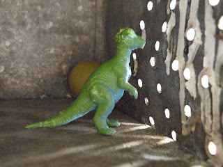
There were a couple of things wrong with this one. (I mean aside from the out-of-focus thing.) Number one is that I did not choose a definite focal point. Is it the light coming through the holes in the side of the old milk box? The dinosaur? The pattern on the floor? Or maybe the half hidden ball? What are we supposed to be seeing here? We also have unbalanced diagonals again - which can sometimes work if they are different sizes, but here they are equal. And they aren't filled equally, so it doesn't feel right. Plus the dinosaur is dead center - rule of thirds violation, beep beep beep! By repositioning the elements of this photo and shifting my own angle, I could have made this shot much better.
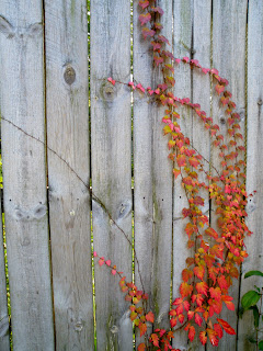
This photo has some good things going on. The lines of the fence move in a different direction than the curving vines, and that is a nice dynamic. Also the contrast between the weathered boards and the orange leaves is nice. One thing mars the effect and keeps this photo from being what it could be - and that is the fact that I failed to align the straight fence line with the edge of the camera frame. So the picture is not straight, and never can be, even if I crop it.
Next we have a picture that is "nice" but boring. The lines are interesting, or could have been interesting, but I put the window in the center. I should have followed the rule of thirds. I could also have added some contrasting shapes, like the curve of a shrub for example. Or, if the severity of line was what I wanted to share, I could have changed my own angle slightly, cut out the left edge of the photo, and re-focused to emphasize the dark lines radiating from the left side of the picture.
Now, here are some photos I took after I had picked up some guideline tips.
I like the curving line from upper left to lower right. I like the repeating pattern of light and shadow on the seam and on the yellow stitching. I like the color, and I love how this is abstract and yet instantly recognizable. I like how it fills the frame.This was a spontaneous shot - I was sitting in my chair trying to decide what to photograph.
I took this at the cemetery. I changed it to black and white on my computer to heighten the dreadful beauty of the image. This time I kept the vertical lines straight, as they should be. The trees behind the monument and the smaller weathered monument next to the massive one fill out the frame without producing clutter. They serve as background that looks appropriate.
This is the cemetery too, but the effect is amusing - I thought the three trees looked like friends, standing around and chatting. Their 'arms' give the shot a sense of animation. This might not exactly obey the rule of thirds, but I think it still works.

Another good technique for composition is to frame the image. The curve of the lake edge emphasizes the reflection of trees in the water. I think I could have zoomed in a bit on this and it would have been more effective.
This tremendous granite ball blew me away. I wanted to capture the sense of its massive solidity and the perfect smoothness of the surface. I like the reflectiveness of the granite - the granite is the focal point because of its size, weight and surface. That's why the background is deliberately blurred - to contrast with the clear stone.
So, summary: make good use of lines, whether they are vertical or diagonal or horizontal; fill up the frame, but not with clutter; pay attention to the rule of thirds; and remember to have a focal point. There are more tips online and I have found it helpful to read, read, read! The result will be better shots, and it will all become second nature.


No comments:
Post a Comment