Wednesday, December 19, 2012

Summing It Up - My Five Best Photographs (so far...)

                           The best thing about this class for me was seeing everybody else's work. I learned from what I saw on these blogs and it was really interesting to see the different ways that we interpreted the assignments. It taught me that what makes a photograph really captivating is whether or not it captures the vision of the photographer. It's useful to have all the tools at your disposal, like the guidelines for good composition and the rule of thirds, and to know how to use them. But the thing that makes a photograph really catch and hold attention is the way it shares a vision of a particular time or place or emotion.

                          I'm going to keep using what I learned this semester to try to make that kind of photograph. I don't know if I am anywhere near accomplishing it, since feedback has been limited. We have not done a great job of commenting on each other's work. But I still learned from seeing the photographs everyone made, and the blog posts were really helpful too.

                         So, here are five photographs I am most proud of. Some I like because they are well composed, or make good use of the rule of thirds, or played around with the aperture to get a particular effect.


Saturday, December 8, 2012

Portraits


          A good portrait is more than a snapshot of somebody. It has to do much more than just show what the person looks like. A portrait should give the viewer a glimpse of the person's character, and also maybe a sense of how the photographer sees the subject.


  I like to make candid portraits. Many people really are more themselves when they are not too consciously posed. If they are busy doing something else, it's easier to get a good shot. This is a portrait of my oldest son, who does not like to pose. Here, he is concentrating intently on a book. The lighting on one side of his face creates a nice shadow. The elimination of any background clutter makes the mood of the photograph calm and reflective. He is a journalist and blogger, so he reads a lot. This portrait is expressive of his character.


                   It's helpful to follow the rule of thirds when you're composing a portrait. As was demonstrated in that lesson, if you put the eyes at one of the grid intersections, it makes for a more compelling picture. My sister-in-law knew I had my camera out, but it takes me so long to get my settings right that by the time I took her picture she had forgotten about it.
                   I used a very shallow depth of field here to make the background as blurred as possible.
She is a thoughtful, gentle person with such a sweet nature, and I think that shows in her portrait.


  A portrait can be the whole person; it does not have to be just a face. (I need to remember that - I usually only photograph faces.) My youngest son had just graduated from boot camp here. A tight face close up would have shown his happiness and pride, but without his uniform it would have lacked context.


On the other hand, a portrait doesn't necessarily have to be taken from the front! This is my son's drill sergeant. The sharp diagonal of his hat brim creates a sense of movement even though he is standing still, and the total lack of background intensifies the drama.


              I made this picture of a good friend who had just finished recording a CD. He needed a photograph for the back cover. I took many pictures that day, snapping away while he played and sang. This was the one he chose. I like the grainy look of it, and the way the guitar is suggested but not over-emphasized.
 

Here is my favorite subject - my niece.

         I was using the zoom lens so I wasn't really that close to her, but she knew I was taking her picture. This doesn't follow the rule of thirds, but here I really wanted to show her quality of direct confidence, and putting her dead center supports that feeling. I love the impish expression!

These are also my niece. The lighting was really good that day - just right for capturing the translucent perfection of a child's skin.


Finally, here is one truly posed portrait. I could have made this picture of my nephew better by widening the aperture - I wish I had. But the background color is harmonious and the brick pattern is okay. What I like about this shot is that his smile is so genuine - this picture shows someone who is generally good-natured and ready for a laugh.


So, that's what I've learned about taking portraits: use the rule of thirds (most of the time) and the guidelines of good composition. Think about backgrounds or lack of them. Get in close. Black and white sometimes helps to establish a mood. And try to catch the essence of the subject's character or the mood of the moment.

Sunday, November 25, 2012

Developing an Eye for Good Composition

Some Guidelines

          If you have an innate 'knack' for good composition, it will be apparent in many ways - most notably in the way you decorate your home. Hanging pictures on the wall requires a good eye, and so does arranging tabletops and fireplace mantles. I know a woman who, when sitting at a restaurant table, unconsciously sets the salt, pepper and other condiments into a pleasing arrangement, totally unaware of her habit.
      
  Even if you lack the knack, there are some simple guidelines that will help you take better photographs - ones that other people love to look at. I found the last assignment about the rule of thirds particularly helpful. Using the guidelines I read about on line, I went back and studied some of my old photos. Then I went and took some new ones.


The picture on the left frustrated the heck out of me. I knew what I saw - but I couldn't seem to get an image that pleased me. I must have taken about twenty shots of this subject - none were what I envisioned. This one came closest. Now, after reading about compositional guidelines, I see what's wrong.
          The horizon line is very faint, but it is discernible... and it's crooked. It runs downward from left to right. The bud's stem comes right up out of the lower left corner, and this creates a diagonal that is clumsy. It would have been better to position it so that it came distinctly from the bottom or a little higher on the left side. Also, the two diagonals created by the flower are visually unbalanced. As far as the extreme noise in the photo, that was deliberate. I wanted it to look like old film.


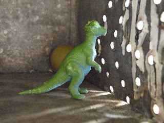
         There were a couple of things wrong with this one. (I mean aside from the out-of-focus thing.) Number one is that I did not choose a definite focal point. Is it the light coming through the holes in the side of the old milk box? The dinosaur?  The pattern on the floor? Or maybe the half hidden ball? What are we supposed to be seeing here? We also have unbalanced diagonals again - which can sometimes work if they are different sizes, but here they are equal. And they aren't filled equally, so it doesn't feel right. Plus the dinosaur is dead center - rule of thirds violation, beep beep beep! By repositioning the elements of this photo and shifting my own angle, I could have made this shot much better.


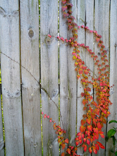
      This photo has some good things going on. The lines of the fence move in a different direction than the curving vines, and that is a nice dynamic. Also the contrast between the weathered boards and the orange leaves is nice. One thing mars the effect and keeps this photo from being what it could be - and that is the fact that I failed to align the straight fence line with the edge of the camera frame. So the picture is not straight, and never can be, even if I crop it.


Next we have a picture that is "nice" but boring. The lines are interesting, or could have been interesting, but I put the window in the center. I should have followed the rule of thirds. I could also have added some contrasting shapes, like the curve of a shrub for example. Or, if the severity of line was what I wanted to share, I could have changed my own angle slightly, cut out the left edge of the photo, and re-focused to emphasize the dark lines radiating from the left side of the picture.


Now, here are some photos I took after I had picked up some guideline tips.


I like the curving line from upper left to lower right. I like the repeating pattern of light and shadow on the seam and on the yellow stitching. I like the color, and I love how this is abstract and yet instantly recognizable.  I like how it fills the frame.This was a spontaneous shot - I was sitting in my chair trying to decide what to photograph.


I took this at the cemetery. I changed it to black and white on my computer to heighten the dreadful beauty of the image. This time I kept the vertical lines straight, as they should be. The trees behind the monument and the smaller weathered monument next to the massive one fill out the frame without producing clutter. They serve as background that looks appropriate.


This is the cemetery too, but the effect is amusing - I thought the three trees looked like friends, standing around and chatting. Their 'arms' give the shot a sense of animation. This might not exactly obey the rule of thirds, but I think it still works.


Another good technique for composition is to frame the image. The curve of the lake edge emphasizes the reflection of trees in the water. I think I could have zoomed in a bit on this and it would have been more effective.


This tremendous granite ball blew me away. I wanted to capture the sense of its massive solidity and the perfect smoothness of the surface. I like the reflectiveness of the granite - the granite is the focal point because of its size, weight and surface. That's why the background is deliberately blurred - to contrast with the clear stone.

So, summary: make good use of lines, whether they are vertical or diagonal or horizontal; fill up the frame, but not with clutter; pay attention to the rule of thirds; and remember to have a focal point. There are more tips online and I have found it helpful to read, read, read! The result will be better shots, and it will all become second nature.


Tuesday, November 6, 2012

The Rule of Thirds

My camera, like most others, has an optional grid that can be imposed on the LCD viewer. It consists of two lines bisecting the image horizontally, and two more bisecting vertically. Before I learned bout the rule of thirds, I thought the lines were just there to help me take straight pictures, and I did not always use them.

Now I understand that I can use the lines to follow the rule of thirds, which states that a photograph will be more visually interesting and arresting if I decide what the main focus of interest is, and place it on or near one of the intersections. This technique keeps you from taking a bunch of clunky shots with the subject sitting dead center.

Boring.

The photograph above shows what happens when you ignore the rule of thirds. I placed the ghost dead center and wound up with a very static, uninteresting shot. But all is not lost! If you mess up and take a boring shot, you can try to improve it with the cropping tool on your computer. The one on mine automatically imposes the 'rule of thirds' grid so that I can position the subject more interestingly.

Much better!   

 The rule of thirds makes it easier and more natural for the viewer to focus on what you want them to see. Here are some more examples of before and after cropping experiments using the rule of thirds.


By the way, it is still not a great picture because I did not make sure there were no trees growing out of their heads. But you can see that it is more satisfying to look at, and it makes the winding path more subtle and interesting. The figures are positioned at the first vertical line on the left.


Ehhhh.
Dynamic!
You can also use the grid on the LCD viewer to position the horizon line, thus avoiding having a photograph with the horizon line right across the middle - that looks clumsy and unsatisfying. Having it at the upper or lower horizontal line is better, depending on whether you want to emphasize the sky, or the earth or water. Either one works, as long as you don't have the horizon right in the middle.


I did take this one using the LCD rule of thirds grid. It helped me to see the horizon as the line between sunny grass and shady grass. Having the massive tree only partially in the picture gives it a nicely framed effect, and it is positioned on the right vertical line.

These last three photos were also taken with the grid.


Monday, October 29, 2012

Fooling with the Flash


Boy, I do not like the pop up flash on my camera.Thanks to the reading (and seeing some of your blogs- thanks!) I do understand how the flash can be used to manage shadows, illuminate a subject, or as fill light to even out the exposure. But I'm afraid the pop up flash on my camera is doomed to remain a little used accessory.

One thing I learned these weeks is that if I set the white balance for the appropriate conditions, and then use the flash, the flash will override the white balance. So if I want to use the pop up flash I might as well set the white balance to auto, and that lessens the control I have over my shots.

I went out on a partly cloudy day with the white balance set for shade. I wanted to emphasize the warm yellow leaves on the trees around the block. The first photo is the one I took without the flash.

I took this one with the flash, even though I knew I was too far away for it to have any real effect. I think it looks tepid and dull. This is when I began to realize the connection between the pop up flash and a manually set white balance.


I knew that to use the flash properly, I had to get close to my subject. I really like how this photo came out. Because of the flash, the light on the leaves almost sparkles, and the shadows the leaves are making on each other are visible, but not too dark.


Many of the experiments I did with the flash resulted in washed out shots like this one.


 I like the no flash picture better.


If you want soft shadows, use the flash. If you want sharp shadows, don't use the flash because it will add light and soften the shadows.

It's fun to play with the flash. These are some pictures I made by shooting into a mirror and a pane of empty glass. The first picture has nothing over the flash. Then I used a paper napkin to drape over the flash and I like how it looks. They are pretty abstract.


Sunday, October 14, 2012

White Balance

I have always felt I could pretty much ignore this setting on my camera, which turns out to be mostly true, for everyday photos. But not entirely!  My camera, with it's white balance set on AUTO, makes good guesses about true color. But this assignment showed me that I can help the camera out by using the settings to make its job easier. 


I took this photo before I knew anything about white balance settings. I had just painted this room and wanted to show my son, who lives in D.C.  The AUTO white balance setting did a good job.  It's close enough to the actual color of the paint and I was mostly satisfied.


For the first photo I took for this assignment, I left the WB setting on AUTO for comparison purposes. 


It was a cloudy day, so next I set the WB to SHADE to warm the colors up a little bit. My camera doesn't have a setting for CLOUDY but I figured this would have the same effect. I think the color looks unnatural; it's too yellow.


I wanted to see what the camera would do if I told it that I was using incandescent light - here is the result. The camera compensated by toning down the warm tones from the picture and the resulting shot is very cold and blue. Pretty awful.


After I understood the effects you can get by overriding the camera's AUTO white balance settings, I played around with some apples.
This is the same room as the first photo, so if you look at the wall behind the table you can see that the AUTO setting captured the color most accurately. The FLUORESCENT setting added warm yellow tones, and the TUNGSTEN setting removed them and made the wall look blue.


tungsten      


auto

fluorescent     


Now, what if you wanted to created a particular effect? I did that here. I put the lens on Macro close-up, used a tripod and a super slow shutter speed to take this shot of some shells and things in a thick, bubbly glass vase.  I was going for a dreamy, other-worldly kind of feeling. On the first shot I set the white balance to compensate for the incandescent light. The second shot has the white balance on AUTO. Which one looks more magical?